So many of our students ask me what my “go to paint color” is.
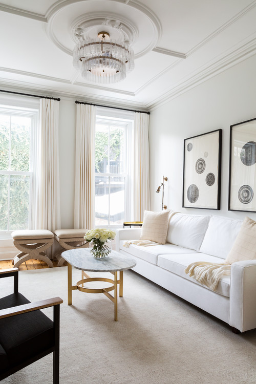
Although I have a few, I’m leading with white right now. White is often associated as modern or minimalistic, but it is also can reflect a homey and cozy style. While color lovers would argue that white is cold, bland and sterile, its advocates would say it promotes spaciousness, hide blemishes and softens a space. No matter what the preference, white can be tricky to specify. Just like gray, white has many undertones, so when selecting a white paint hue there are many things to consider. In this blog, I’m going to share with you some of my favorite tips in selecting white paint color.
Tip #1 Find the Undertone
First and foremost, when selecting a white paint color, I always look at the paint swatch on a piece of white copy paper. This enables me to see more clearly the underlining undertone(s).
To avoid costly mistakes, I suggest using the following simple and foolproof technique when selecting a white paint color. In the example below, you will see that I have placed three Sherwin Williams white color chips on white copy paper.

The top chip is called Toque White SW7003, you can see that once placed on the white copy paper it has an orange undertone.
The middle color is called Alabaster SW 7008. This white has a yellow undertone.
The bottom color is called Snowbound SW 7004. This white has a grayish undertone.
Tip # 2 Proper Viewing of the Paint Chip
When looking at a paint chip, first determine how it will be applied horizontally (on a ceiling) or vertically (on the wall), then view it from that position. Shadow and light will affect both the horizontal and vertical viewing planes. For example, when painting a wall NEVER lay the paint chip down horizontally on the floor or on a table. It will cast a shadow and you will not get a true read on the color. I always bring painter’s tape with me to adhere the sample to the wall or the ceiling depending on the application.
Tip # 3 Warm Whites vs. Cool Whites
Whites have undertones that are either Warm or Cool. Warm whites will have a yellow, red or orange creating a cozy feel. Cool whites are made up of blue, green and gray and look and feel cool and crisp. The determining factor in selecting the perfect white for a room is to decide if you want the space to look and feel warmer or cooler.
Tip #4 Consider Lighting
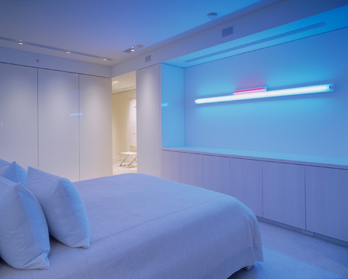
Light bulbs: fluorescent light will cast a blue hue in a white room, while an incandescent light bulb would cast a yellow hue. However, today you can purchase lightbulbs in both cool and warm tones. Be sure to ask the client how they want the room to look and feel and always consider the lighting when selecting a white paint color.
Natural Lighting: Natural light is another important factor to consider when selecting white paint for your client. A southern-facing room will feel warmer so you may want to offset the space with a cooler white, while a north-facing room will look and feel more gray or blue and feel chillier.
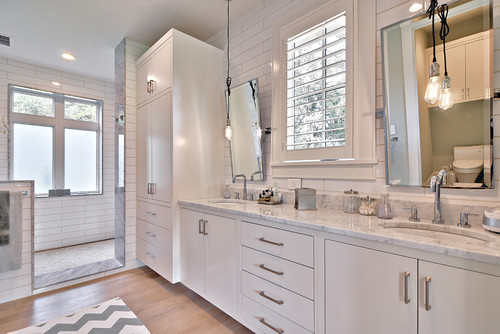
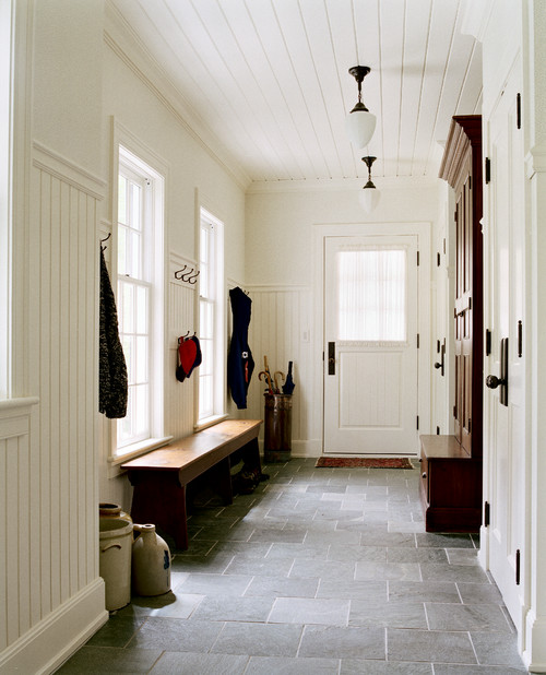
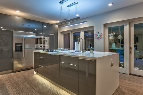
Tip #5 Trim and Cabinets
When selecting white for cabinets, I often select the same white on the kitchen or bathroom cabinets as the trim. This keeps things safe and congruent.

Tip #6 Mix it Up
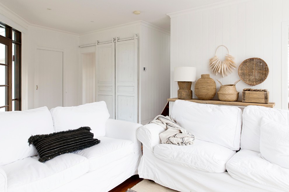
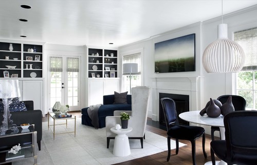
If the client wants a monochromatic color scheme using varying hues of whites, then I’ll mix it up. This is when off whites and cool whites are combined to create a monochromatic color scheme. This very specific look is popular today and falls under Shabby Chic, Scandinavian and Farmhouse style.
If you would love to learn more about color we invite you to take one of our LIVE Decorating and Staging Classes or study on your own with our online EXPRESS Decorating Class.

KARLA C. URBIZO
In 2017, after working together in complete synergy for more than a year (and having a blast in the process), Melanie and Karla became partners and renamed the school the Staging and Decorating Guild. They both had a goal: inspiring and training others to create lucrative and fulfilling careers in the field.
In 2020, she also became Design and Color Consultant for NHance Kitchen Refinishing Orlando, helping homeowners create the kitchen of their dreams.